
Logo Concept
Puglia’s ceramic tradition forms the conceptual foundation of the logo, drawing on the visual language of handcrafted plates decorated with flowing lines, geometric patterns, and warm earthy tones. These elements translate the region’s craftsmanship and vitality into a contemporary graphic identity that expresses continuity, authenticity, and a deep connection to place.
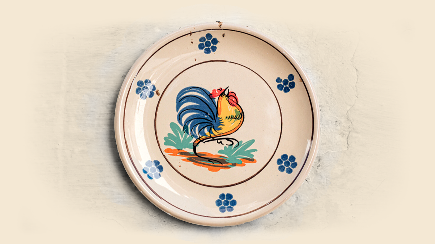
At the heart of this visual system stands the Rooster, a recurring motif in Puglia’s ceramics and a symbol of good fortune and renewal, reinterpreted in a modern form aligned with the event’s visual language. The logo also incorporates a human figure with open arms.
1) Color Palette – The color palette is directly drawn from the primary tones used in traditional ceramic decoration, especially those used in Rooster ceramics. Yellow, orange, red, and blue echo the vivid pigments of hand–painted plates, while the dark brown stroke represents the painterly brush line typical of ceramic craftsmanship
2) ISMAR Logo – The ISMAR logo is inspired by the Japanese Kanji “合” turned upside down, symbolizing the merger of the original ISAR (International Symposium on Augmented Reality) and ISMR (International Symposium on Mixed Reality) conferences. Its stylized human figure with open arms reflects a welcoming, inclusive spirit, while its form echoes motifs from Apulian ceramics, reinterpreted in a modern, minimal design.

Design Elements
- Core marks: Reworked ISMAR icon and wordmark.
- Line style: High-contrast outlines referencing ceramic brushwork.
- Palette: Primary red, yellow, blue with Puglia’s blues.
- Motifs: Rooster and floral tiles.
- Grid and usage: Modular tiles that scale.